
Created by Dan Goodspeed
using data from New York Times and
visualization help from Flourish.
Some have asked for ways to donate to help keep the charts updated and create new ones. It takes me about an hour a day to update the eight charts. I'm not expecting much, but if you'd like, I made a few options. I also made a monthly email newsletter with chart updates exclusively for supporters. Thanks! -Dan
Animated bar graph chart of new weekly COVID cases, state-by-state

Animated bar graph chart of new weekly COVID deaths, state-by-state

Animated bar graph chart of total COVID cases, state-by-state

Animated bar graph chart of total COVID deaths, state-by-state
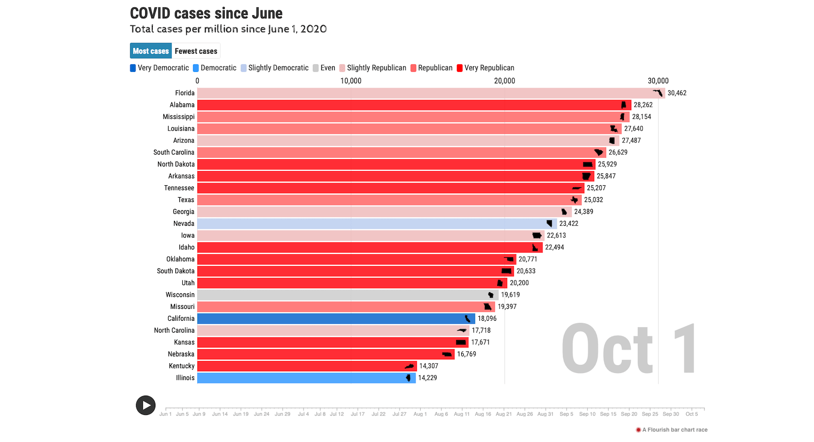
Animated bar graph chart of total COVID cases, state-by-state, since June 1
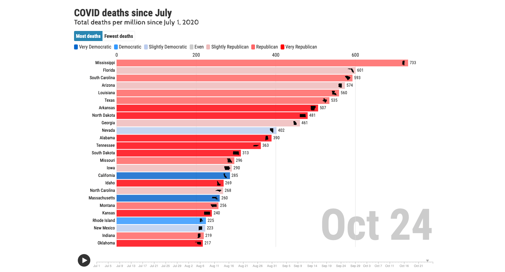
Animated bar graph chart of total COVID deaths, state-by-state, since July 1

Animated bar graph chart of an index factoring both cases and deaths, over a rolling 90-day period

Animated bar graph chart of total COVID cases since June 2021, cross-referencing state vaccination rates

Animated bar graph chart of total COVID deaths since June 2021, cross-referencing state vaccination rates
* "Normalization" (perhaps better called "smoothing") means the abnormalities in the data were evened out. For example, if there were 10 days in a row of a few cases/deaths a day and then one day of 1000... that looks awful and frenetic on a chart like this, even when framed in a per-week display. In reality, that 1000 is just a backlog catch-up, so I normalized it by spreading the thousand over previous dates for a more even / more realistic data. It works similarly when the total number of cases/deaths drops one day. Likely a correction from a previous report, I just subtracted the difference over previous dates to numbers that are probably closer to reality.